One of the guiding principles in the development of Scania’s new generation of trucks was to create work vehicles for professionals, featuring the world’s best driver environment. The result, after a more than a decade of work, shows all the signs of setting a completely new industry standard.
As Scania prepared to launch its R-Series in 2004, work had already begun on the next generation of trucks. Working within a number of new projects, the company’s designers sought a deeper understanding of the qualities that distinguished Scania as a brand and characterised its products. Customers and drivers in different segments and markets around the world were interviewed about what Scania meant for them.
“We also looked at what assets from our own history could be developed and we studied how society might look over the coming the 5, 10, 20 or 50 years,” says Kristofer Hansén, Head of Scania’s Styling and Industrial Design division.
Driver safety, vision, and interior space
In parallel with these more theoretical studies, Scania’s designers conducted a number of projects involving experimenting with the layout and functionality of the cab. Based on in-depth studies from ergonomists, different conceptual ideas, and personas (imaginary typical customers), a number of proposals were developed for possible solutions for how the driver environment, sleeping area, storage and other features could take shape, design-wise, in the future.

One particular important decision in terms of the design that was made very early on was to move the front axle 50 mm further forward in the next generation of trucks. This has allowed the driver’s basic position to be moved 65 mm closer to the windscreen and 20 mm out towards the side compared to earlier cab generations.
“Above all, this allows for major improvements in terms of driver safety, vision, and interior space,” says Hansén. “We also got more space for seat adjustment, storage and the bed. Overall, it helped produce a truck that’s even easier to manoeuvre and has a whole new field of vision from the driver’s position.”

The starting point for work on the next generation was that Scania is one of the best trucks to drive and use – and that is should become even better. A big part of the development work, therefore, involved creating an absolutely world-class driver environment.
“With our work we aimed for what we sometimes called “masterful control of majestic power,” says Hansén. “It was a description of an outstanding driver environment. It’s what you, as a driver, feel when you have climbed up into the cab and have all that power under you. It communicates directly with you through the wheel, the interior, the sound, colours and functionality.”

Hansén continues, “So, the new interior and the driver’s position don’t try to hide that this is a working environment for professionals. The feeling behind the wheel should be like steering a big, powerful premium car, while also simplifying and strengthening functionality through the new digital interface integrated into the driver’s position.”
Well crafted design
Field test drivers, customers and other test personnel have, during development work, experienced a level of quality and design in Scania’s new truck cab that is completely new for the industry. Repeatedly heard comments include that the design is well crafted and well thought out, and that it gives the driver a strong sense of being well looked after.
Hansén explains, ”Every part and every feature has been exposed to an intense process of questioning and evaluation, and we haven’t taken the easy option of using solutions that after a short period of use will be perceived as meaningless and irritating.
When it comes to the new truck’s exterior, Scania has placed the greatest emphasis on aspects related to aerodynamics and, as a result, fuel consumption. All surfaces, including the front, the sides and even the underside, are optimised for the lowest conceivable drag.
A powerful interior
The exterior design of the new generation of trucks is also built on an approach of asking the question what the product stands for and what Scania wants to convey. But what can designers do with the square box that a truck cab literally is?
”Early on in the project, we determined that we were more agile in our expression than our competitors, and also in our way of looking at what we offer as a brand,” says Hansén. “It’s not just a truck, but rather a whole transport service..
 Hansén continues, “‘Athletic’ was another word that resonated early on, sometime around 2007. We shouldn’t be some big, strong lump – like a sumo wrestler – but rather a first-class race horse – a thoroughbred – without an ounce of extra fat around its muscles. This, of course, all corresponds with the fantastic engine that we’re known for.”
The guidelines for Scania’s new trucks were, thus, to continue to emphasise the existence of the powertrain, with a clear, big front cover and the surfaces around the truck serving as the aerodynamic coverings to a powerful interior.
“For this reason, the design language is now more controlled, with sharper lines but at the same time a more accommodating roundness, instead of extreme angularity or simpler, trendier, round areas, which it would have been significantly simpler to build up a design around.”
Another goal for Scania’s designers was for the new truck to be a market leader in terms of aerodynamics while at the same time incorporating features that were previously applied separately, such as the sun visor or extra wheel trim.
Avoiding huge dash units
As part of the basic configuration, position lights and extra lights are now located within the chassis, without negatively impacting aerodynamics. This opened the way for using specific form elements that allowed for the integration of new types of lamps in the cab and chassis, something that heavily contributed to how the new trucks is perceived as a whole.
The design of the new dashboard is also built on a desire to avoid the clumsy and huge dash units that are often found in trucks.
“We have also tried to express a sense of ‘Agile Strength’ and ‘Flexible Power’,” says Hansén. “Seen from above, the instrument panel has a wing profile that clearly delineates the driver side from the passenger side, or living room if you like.”
Hansén concludes, “The panel that the controls sit on is divided up into two segments, an upper and a lower part with an elegant horizontal step in the middle. This makes it easier to find what you’re looking for, you can support your fingers on it, and it makes selection easier and clearer than if we had used a big flat surface with the controls placed wherever.”
No unnecessary fat
Scania’s new generation of trucks has been designed and developed by the company’s own designers. The guidelines for the design of Scania’s new trucks were to continue to emphasise the powerful engines, but within a slimmer and more athletic form.
“The new trucks communicate a sense of power, but in a new, more efficient and more flexible way than the previous generations,” says Anders Lundgren (left), Team Leader for Exterior Styling on the new generation of trucks. “There’s no unnecessary fat around the muscles – these are thoroughbreds.”
 Human touch
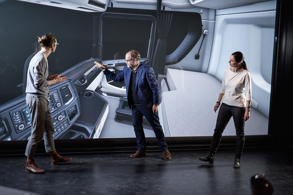
Anna Selmarker leads Scania’s efforts in the field of Human Machine Interface (HMI) – the digital interaction between human beings and machines. One of Selmarker’s most important tools is a driver simulator that can simulate virtually any environment or situation that a driver might be exposed to. A good example of the results is the new dashboard, where drivers can simply and intuitively find the information they require.
“Our vision is for Scania drivers to always be able to say that they perform best, because they have vehicles that support them in the best and most efficient ways,” she says. “That’s been the guiding principle in our work with the new generation of trucks.”

Passanger car feel
Christina Isomaa is Team Leader for Colour and Trim for the new truck generation. She and her team work on the colours, textures, and materials of a variety of different details, both within the cab’s interior and on its exterior.
“There have been lots of changes in terms of colours and material choices in the new generation of trucks,” says Isomaa. “We have textiles and other materials that can withstand dirt and heavy wear, leathers with fantastic qualities, and small details that create that little bit extra like wood and metal. These are things normally only seen in exclusive passenger cars, so we’re really pleased and proud of these new features.”
Passion for details
Håkan Kåreby and the Appearance Approval team literally put on white gloves to examine Scania’s new trucks in detail. The team is responsible for the final quality check on all incoming articles.
“We thoroughly investigate all parts to check that they are consistent with the idea and the vision that we have for the next generation of Scania trucks,” says Kåreby. “In practice, this means that we examine every visible item, about 2,600 parts. We work with our eyes, which are our primary work tool. We have digital verification tools, we use CAD and other support systems, but our eyes are always superior when it comes to judging colour and shape.”
Driver’s best friend
Scania’s Styling department has spent a lot of time improving ergonomics and the user-friendliness of the driver environment in every conceivable way.
“We work with biomechanical ergonomics, adapting the driver environment to the driver’s bodily requirements and limits,” says Fredrik Pehrson at Scania’s Physical Vehicle Ergonomics division. “Typical questions were how the driver’s seat should be designed. But we also work with macro-ergonomics, adapting the entire cab environment to the drivers’ overall needs in terms of living in and moving about the cab.”
“Over the years, we have met and interviewed many drivers to identify their needs in all aspects: direct and indirect sight, space within the cab, the work involved in getting in and out of the cab, the ability to sleep well and store their things, and so on.”


